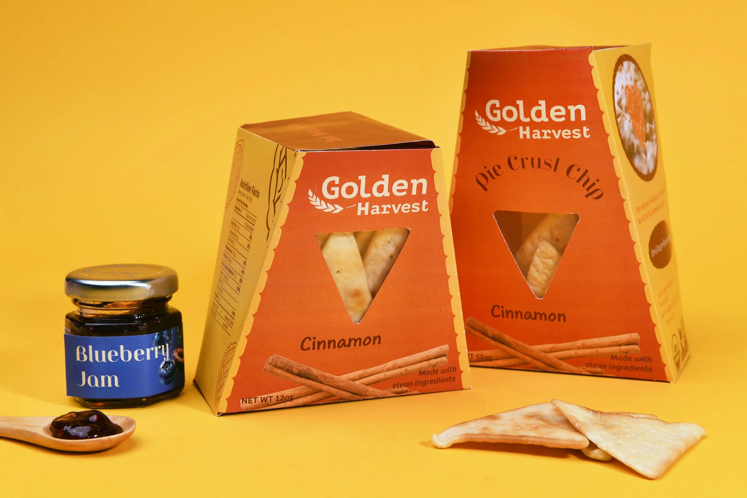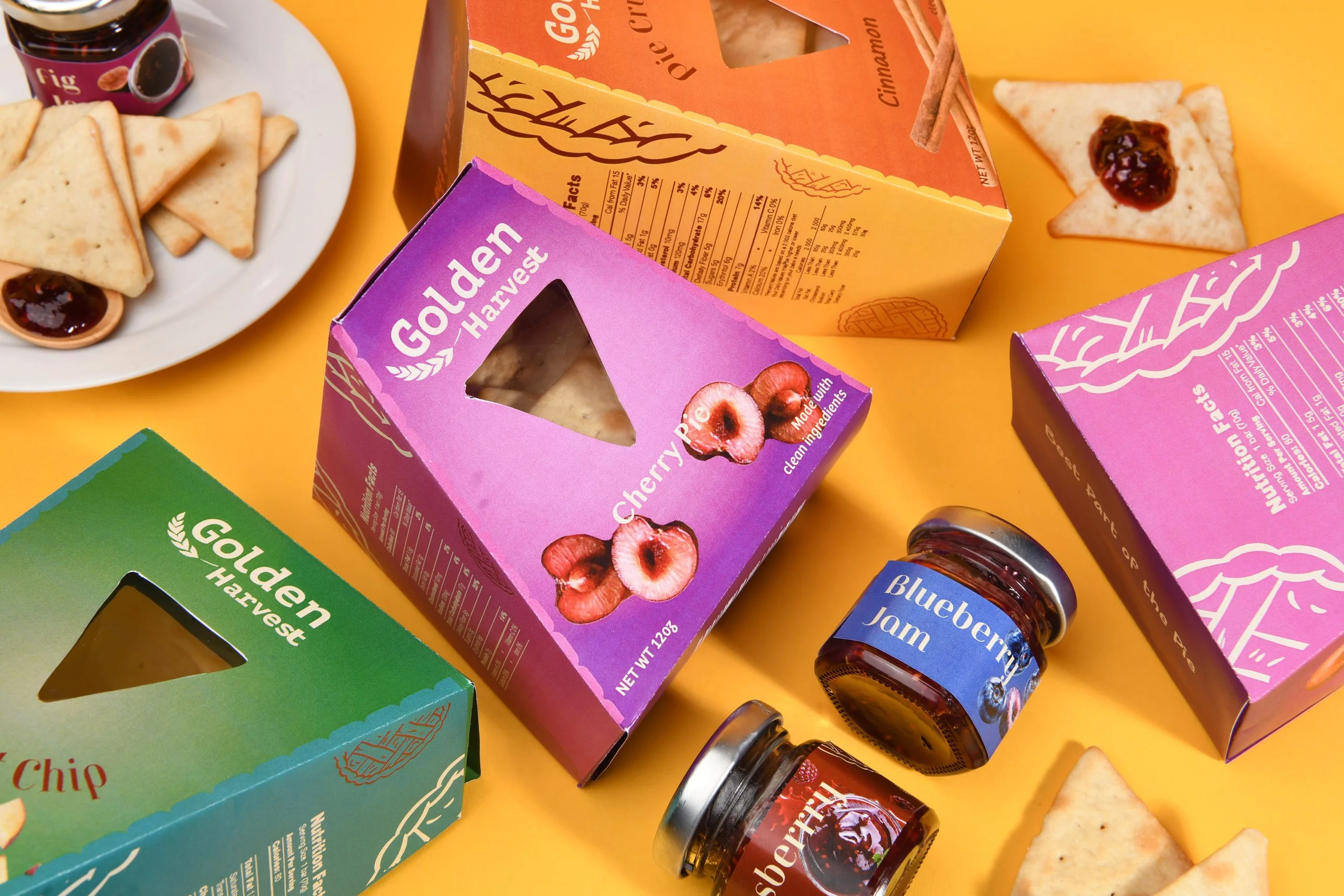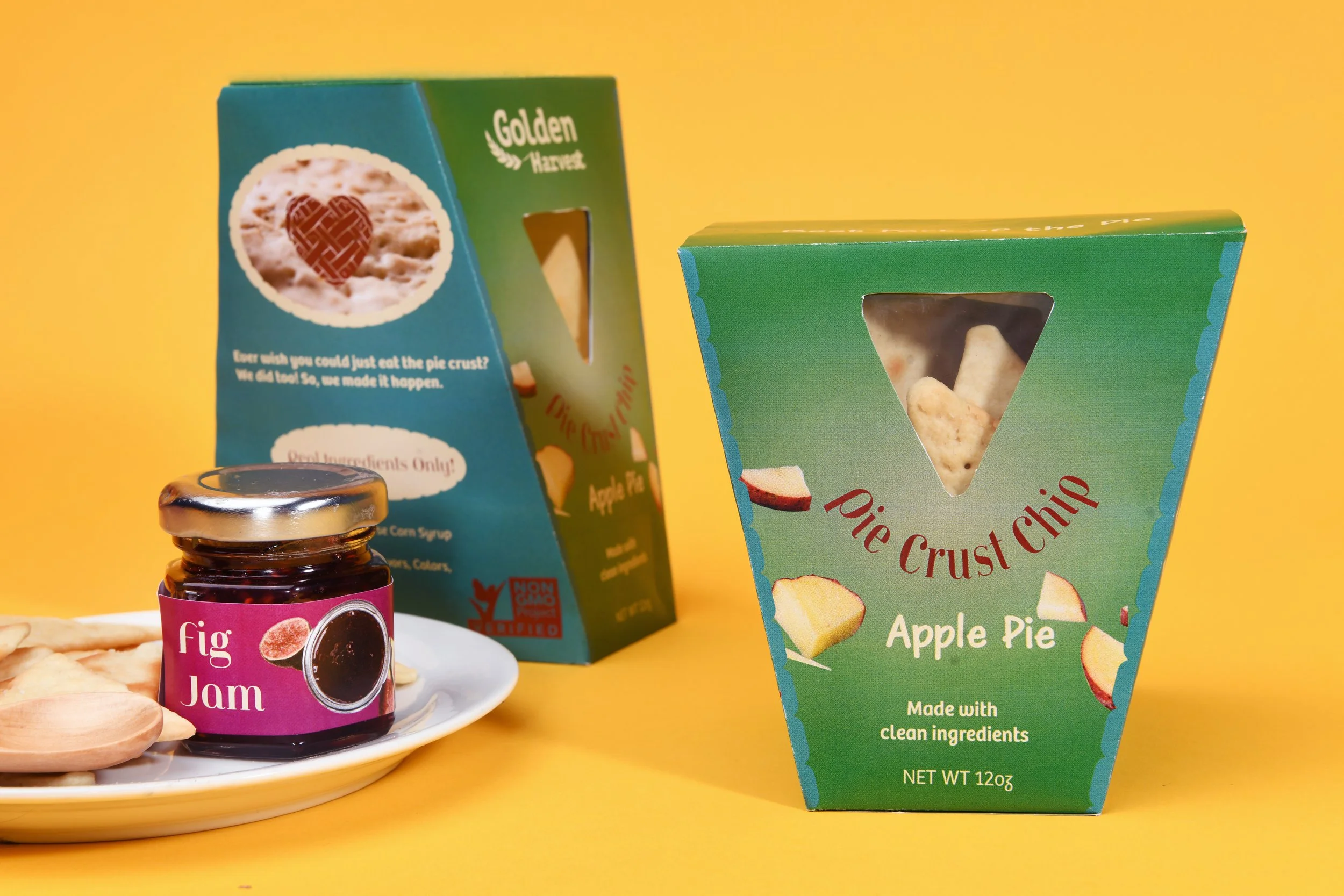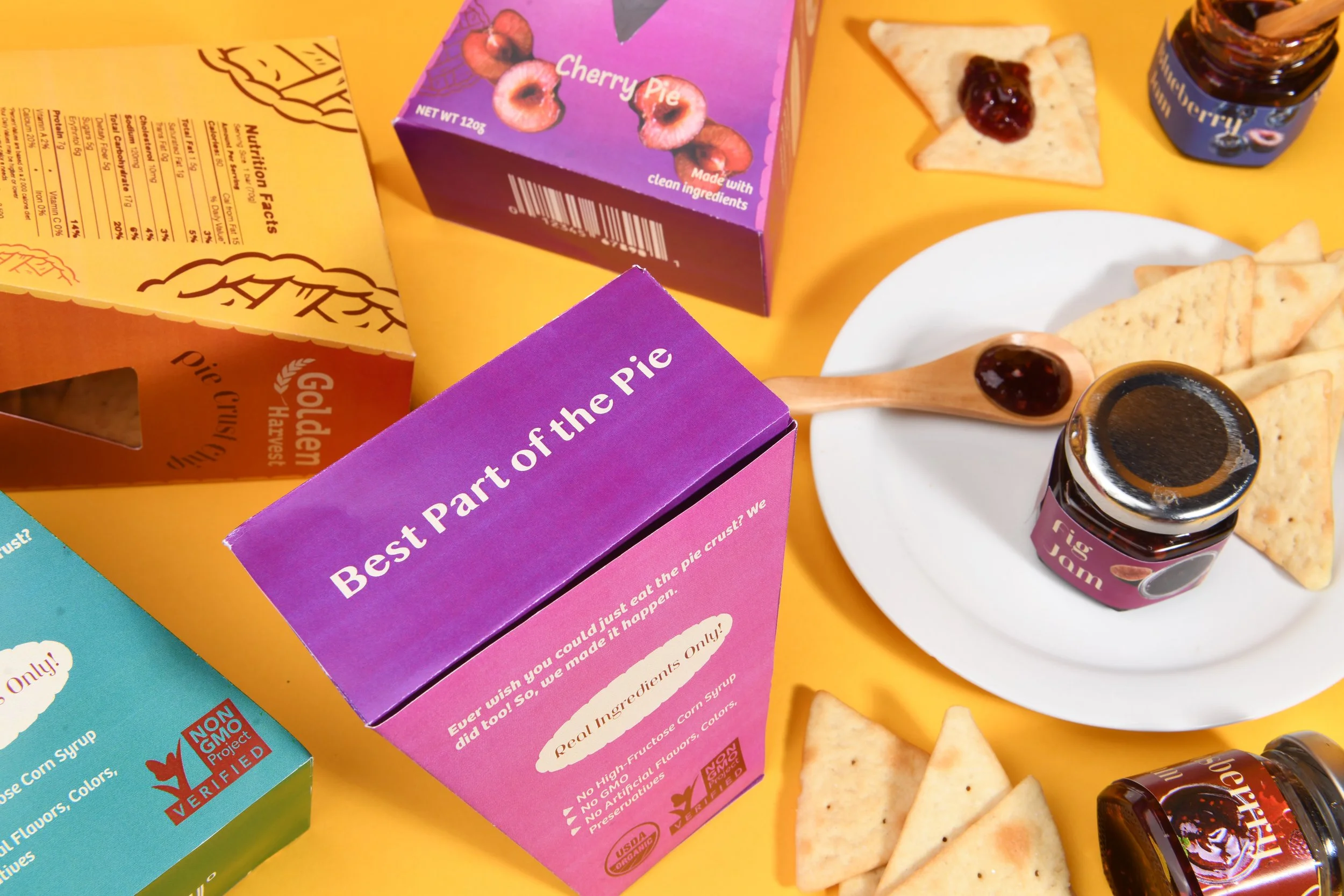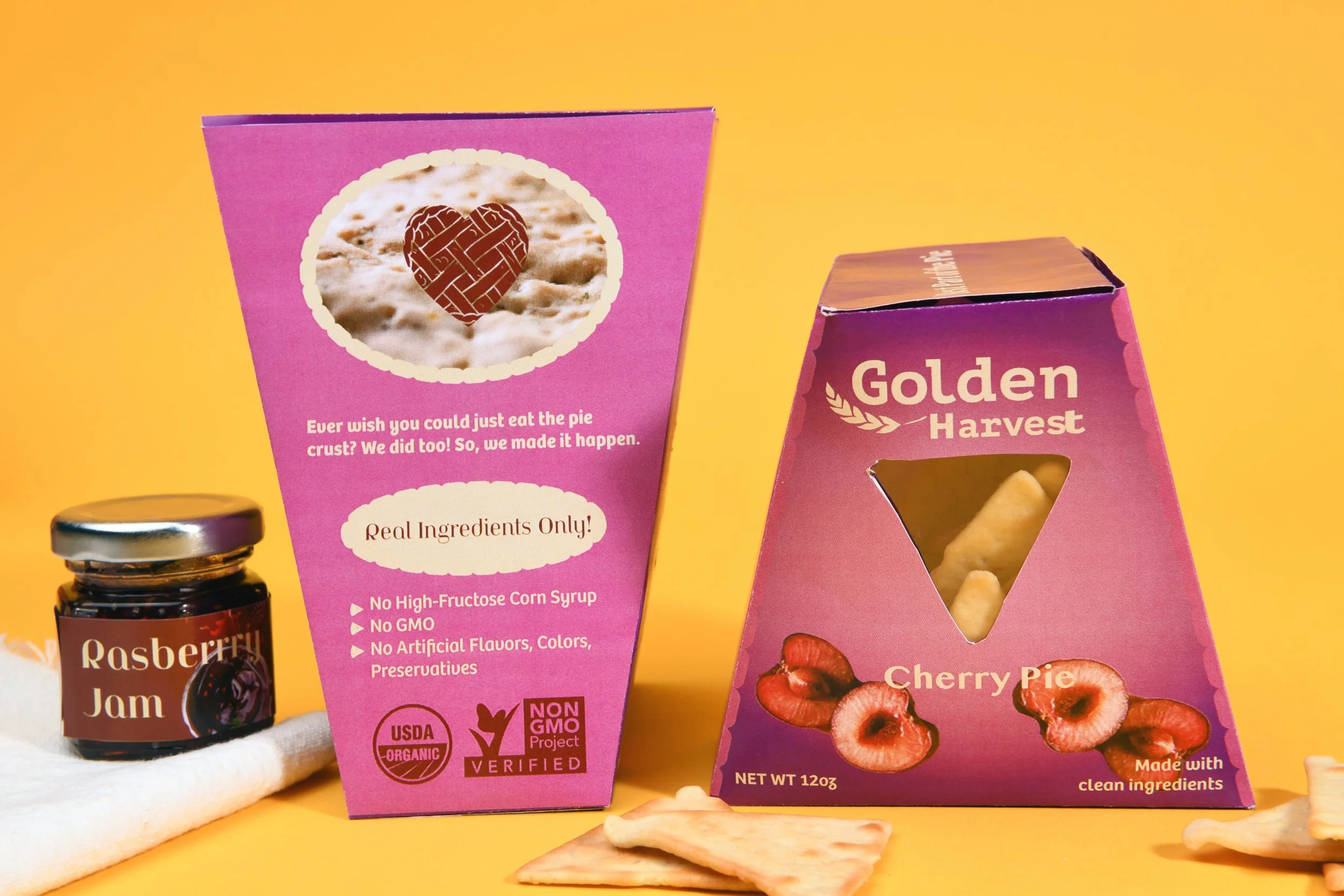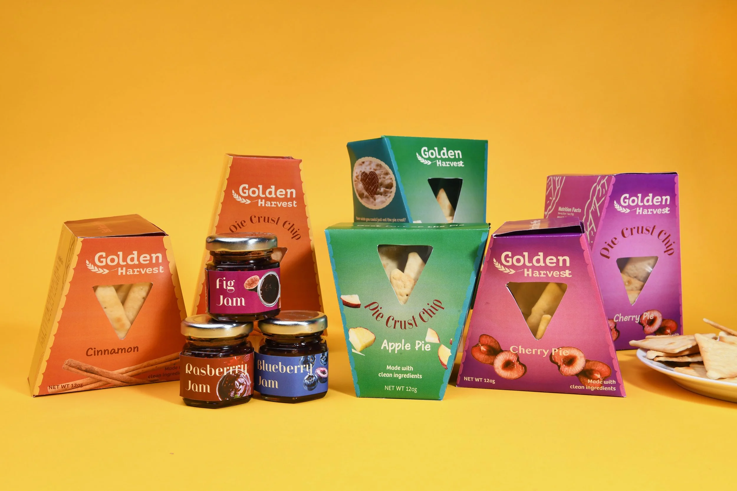
Golden Harvest
Pie Crust Chip
-
The snack aisle is loud and it all looks the same. Millennial and Gen Z consumers are buying snacks with more intention reading labels, seeking quality, expecting something worth talking about. But the shelf rarely delivers. Most "elevated" snack brands lean on buzzwords without the product to back it up, and the packaging that's supposed to signal premium often feels indistinguishable from everything next to it.
-
A pie crust chip is a new and entirely different texture and palette experience. It carries nostalgia, craftsmanship, and comfort. The design had to make that instantly clear, in a store aisle, to my audience as a brand new product.
-
Golden Harvest was built around the idea that indulgence can be intentional. The packaging system leads with warmth and honesty communicating high-quality, all-natural ingredients without hiding behind fine print. A flavor range spanning sea salt and parmesan to truffle and everything bagel spice demanded a visual language flexible enough to feel cohesive across SKUs while still letting each variety breathe. The result is shelf presence that earns attention without shouting premium, grounded, and immediately appetizing.