Hera
Women Focused Care
-
Women of color face measurable, documented harm inside the medical system. Higher maternal mortality rates, chronic misdiagnosis, and a pattern of being dismissed by providers have created a justifiable absence of trust. Most healthcare brands address diversity at the surface level, hiring for representation while leaving the underlying system unchanged. That distinction is exactly what Hera was built to close.
-
Trust is a design decision. The research made clear that this audience does not need to be convinced that healthcare matters. They need evidence, visible in every touchpoint, that this particular system was built with them in mind and not simply adjusted to include them.
-
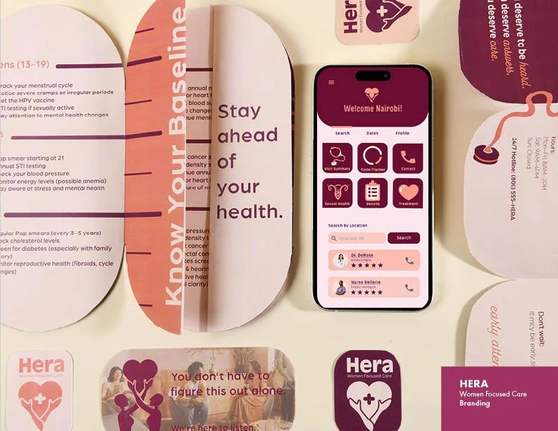
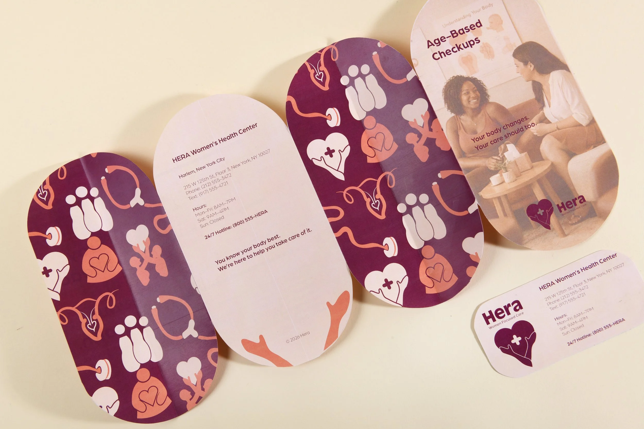
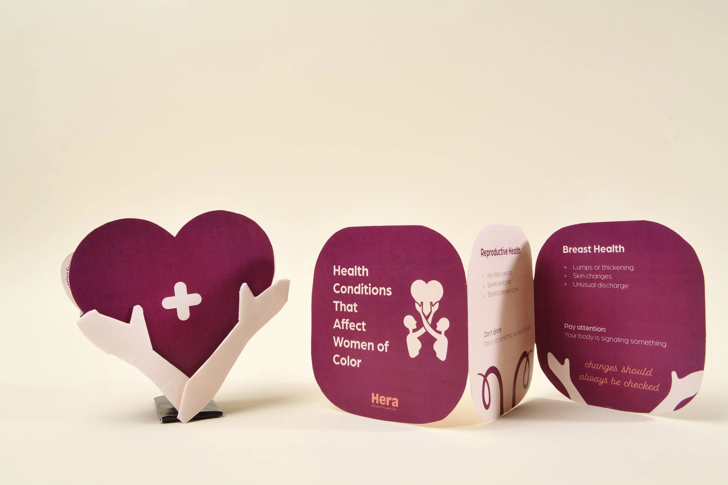
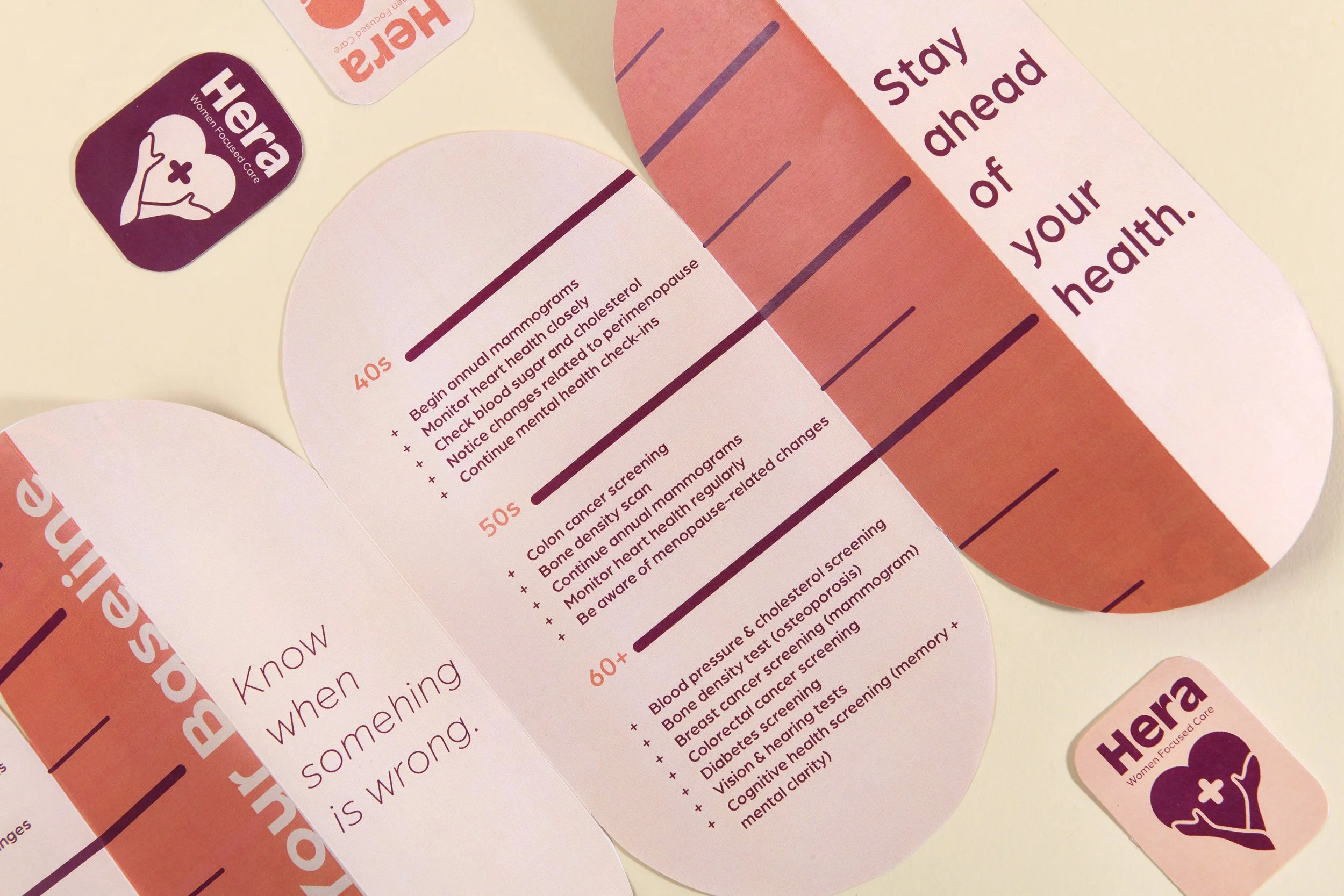
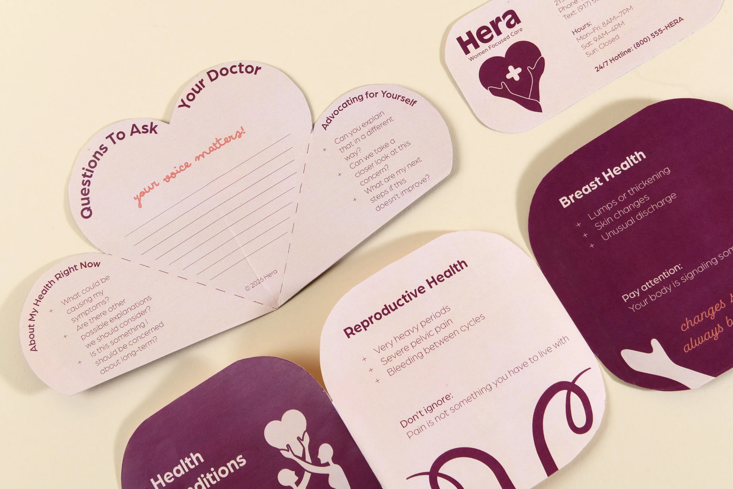
Hera was designed from the inside out, starting with a care model and working outward to identity. The brand kit, web presence, medical pamphlets, posters, storefront, and facilities all carry the same argument: you are a partner in your own health, not a patient to be managed. The visual identity is warm, confident, and precise, chosen to communicate competence and compassion simultaneously. Copy across all touchpoints centers patient voice and lived experience rather than clinical distance. Every material, from a waiting room poster to a digital ad, was treated as an opportunity to rebuild trust one honest interaction at a time.